


 Reply With Quote
Thanks alot Triv1um, you've been a lot of help to me, now could you just tell me how my new sig is?
Results 11 to 19 of 19
Thread: Hows my new sig?
-
March 25th, 2008, 18:10 #11DCEmu Newsposter


- Join Date
- Feb 2007
- Location
- Derby, UK
- Age
- 32
- Posts
- 3,200
- Rep Power
- 127
 Light source -
 Originally Posted by nomi

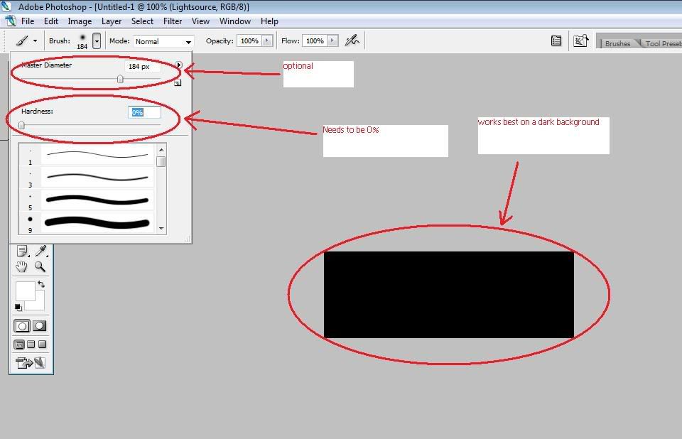
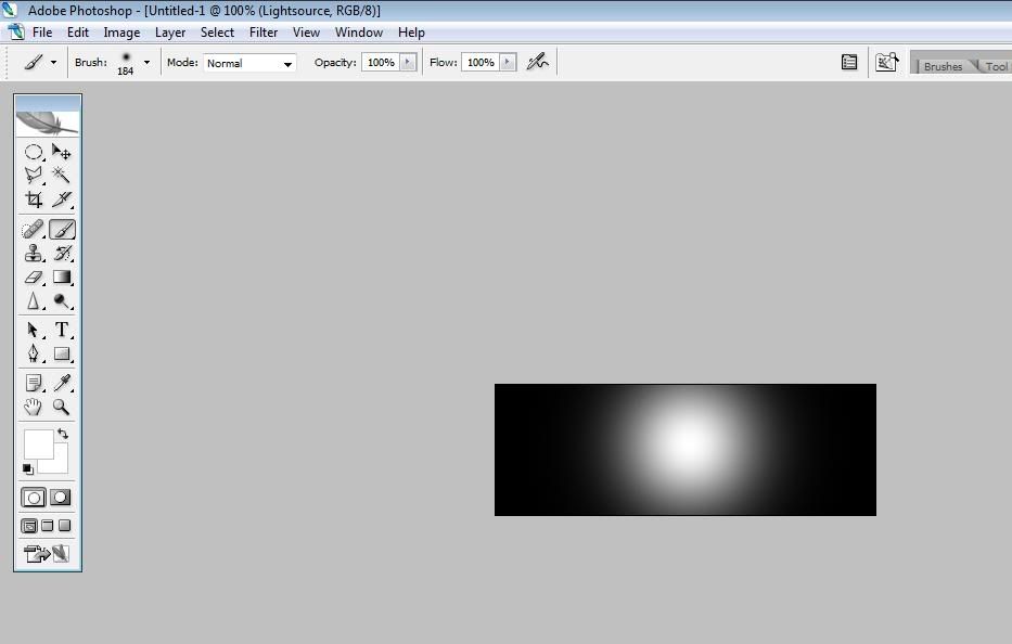
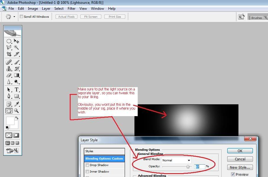
(Of course, you adjustment gradient layers over the light source to get the soft colours to suit your sig)
------
High res image - This is just how big the image is.
Say you have a mini image (10px X 10px) and you stretch it to 1000px X 1000px your going to get a pixelated mess.
So, keep to big high quality renders. So you can work with them better.Last edited by Triv1um; March 25th, 2008 at 19:41.
PSN (PS3/PS4/Vita)/NintendoID - Triv1umx
Steam - Rjinswand
Runescape - Rjinswand
-
March 26th, 2008, 05:23 #12PSP Mod Creator

- Join Date
- Dec 2005
- Location
- Karachi, Pakistan
- Posts
- 328
- Rep Power
- 0


Beta Tester: Windows 7
-
March 26th, 2008, 14:50 #13DCEmu Newsposter
- Join Date
- Feb 2007
- Location
- Derby, UK
- Age
- 32
- Posts
- 3,200
- Rep Power
- 127
Its ok.
Have you used the stroke affect around the render? Dont.
Download some photoshop brushes to make it a wee but more interesting.
Darken the background up. Add a light source.PSN (PS3/PS4/Vita)/NintendoID - Triv1umx
Steam - Rjinswand
Runescape - Rjinswand
-
March 26th, 2008, 22:54 #14Acorn Electron User
- Join Date
- Nov 2004
- Posts
- 780
- Rep Power
- 77
I'd say it might look nicer with a more fiery coloured background as the blue is quite striking and almost draws the eye away from the main focus. Something warm and rich. Using a gradient map adjustment layer above the background might do the job, or the hue/saturation function. Maybe you could overlay some symbols from the game over the background too to add to that epic feel if you fancy playing around a bit.
-
March 26th, 2008, 23:46 #15DCEmu Newbie
- Join Date
- Mar 2008
- Posts
- 1
- Rep Power
- 0
Triv1um: Nice work. Good advice given.
naomi: Great efforts! For beginning it's very nice. I agree with Triv1um in that a light source would set it off better. I can tell you were going for a type of shadowing from behind so the light source would set that off well. I was guessing you were using Corel Draw or Corel Photopaint because the background texture resembles many that are in Corels stock texture lists. Both good programs as well as Photoshop. Don'tcha just love how an art project just comsumes ya with passion?...it's like a drug for me. =)~
-
March 27th, 2008, 13:46 #16PSP Mod Creator
- Join Date
- Dec 2005
- Location
- Karachi, Pakistan
- Posts
- 328
- Rep Power
- 0
I will upload the rest of my works later, please check them out!
Thanks for your help everyone!
Beta Tester: Windows 7
-
March 29th, 2008, 16:56 #17DCEmu Old Pro
- Join Date
- May 2006
- Posts
- 1,386
- Rep Power
- 101
blue really doesnt match kratos IMO, but the second one was a lot better :P
anyway follow what trivum said :P i dont really know how to make things better myself XD
-
March 29th, 2008, 19:40 #18PS3 User

- Join Date
- Dec 2005
- Location
- Bronx, NY
- Age
- 35
- Posts
- 1,241
- Rep Power
- 85
Since you're going with Kratos, red would have looked a lot better. Just keep practicing and you'll become better.

-
March 29th, 2008, 19:51 #19PSP Mod Creator
- Join Date
- Dec 2005
- Location
- Karachi, Pakistan
- Posts
- 328
- Rep Power
- 0
http://www.dcemu.co.uk/vbulletin/sho...d.php?t=100604
Could you guys go here and comment on the sigs I posted here?! please...
Thank You
Nomi
Beta Tester: Windows 7
Thread Information
Users Browsing this Thread
There are currently 1 users browsing this thread. (0 members and 1 guests)

Bookmarks