


personally, i think it looks better in negative than that other one
Results 1 to 10 of 218
-
August 12th, 2006, 18:12 #1DCEmu Legend


- Join Date
- Dec 2005
- Location
- Galaxy not far away?
- Age
- 36
- Posts
- 4,656
- Rep Power
- 101


 another opinion needed for metroid project!!!!
ok, and here are the edited metroid background for the eboot and the icon:
icon:

background:
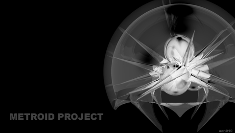
need opinions about this!!!
thank you
-
August 12th, 2006, 18:13 #2DCEmu Legend


- Join Date
- Dec 2005
- Location
- Bay Area, California
- Posts
- 2,892
- Rep Power
- 105

-
August 12th, 2006, 18:15 #3DCEmu Legend
- Join Date
- Dec 2005
- Location
- Galaxy not far away?
- Age
- 36
- Posts
- 4,656
- Rep Power
- 101
yeah, thats what i thought also, thank you
-
August 12th, 2006, 18:17 #4DCEmu Legend
- Join Date
- Dec 2005
- Location
- Bay Area, California
- Posts
- 2,892
- Rep Power
- 105
your welcome. one suggestion would be maybe putting a small psp in negative next to the metroid
-
August 12th, 2006, 18:18 #5DCEmu Legend
- Join Date
- Dec 2005
- Location
- Galaxy not far away?
- Age
- 36
- Posts
- 4,656
- Rep Power
- 101
upper?
lower?
left?
right?
-
August 12th, 2006, 18:20 #6DCEmu Legend
- Join Date
- Dec 2005
- Location
- Bay Area, California
- Posts
- 2,892
- Rep Power
- 105
two thirds of the way up on the left side
 make sure tis pretty small to not take away from the metroids impressivness
-
August 12th, 2006, 18:21 #7PSP User

- Join Date
- Jul 2006
- Location
- Salerno, Italy
- Posts
- 339
- Rep Power
- 68
Right on the "metroid project" writing.
-
August 12th, 2006, 18:22 #8DCEmu Legend
- Join Date
- Dec 2005
- Location
- Galaxy not far away?
- Age
- 36
- Posts
- 4,656
- Rep Power
- 101
ok, i will.
thank you again
-
August 12th, 2006, 18:24 #9DCEmu Legend
- Join Date
- Dec 2005
- Location
- Bay Area, California
- Posts
- 2,892
- Rep Power
- 105
looks awesome btw
-
August 12th, 2006, 18:28 #10DCEmu Legend
- Join Date
- Dec 2005
- Location
- Galaxy not far away?
- Age
- 36
- Posts
- 4,656
- Rep Power
- 101
everything made by scratch!
yay!
ok psp logo all the way in the corner not too big and that blends to the pic.
got it
Thread Information
Users Browsing this Thread
There are currently 1 users browsing this thread. (0 members and 1 guests)

Bookmarks