


 Reply With Quote
yeh dont make it so bright, maybe even make it off the sig...
Results 171 to 180 of 279
-
February 22nd, 2007, 22:24 #171DCEmu Legend


- Join Date
- Feb 2006
- Location
- 6 Feet Under
- Posts
- 2,348
- Rep Power
- 84

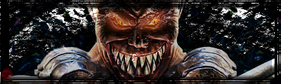
 well in my opinion lenss flare is to bright taking away from the pic because the eyes just go stright to the flash so maibe by dimming down the ress it will look better. I made the brush for PSP XI but i can transfer it to CS2 or CS3 let me know witch programe you have.:thumbup:
 Originally Posted by Cheyzak

-
February 22nd, 2007, 23:52 #172DCEmu Art Pro
- Join Date
- Apr 2006
- Posts
- 1,950
- Rep Power
- 96

-
February 23rd, 2007, 10:41 #173DCEmu Regular

- Join Date
- Sep 2006
- Location
- Here and there
- Posts
- 252
- Rep Power
- 68
What about text?
Thanx for the help guys.
-
March 6th, 2007, 16:05 #174DCEmu Legend
- Join Date
- Feb 2006
- Location
- 6 Feet Under
- Posts
- 2,348
- Rep Power
- 84
Here are two new ones i put together rather quickly. Anybody can have them.

-
March 7th, 2007, 16:41 #175DCEmu Newsposter


- Join Date
- Feb 2007
- Location
- Derby, UK
- Age
- 32
- Posts
- 3,200
- Rep Power
- 129
my sig is my latest disaster piece.
my first ever sig.
my gosh, I need a tuturial or something. What can be improved? (dont say everything)
Edit -
Haha i got - Rep for this, not nice!!! rofl
Just because 'trivium suck' no need to - rep.PSN (PS3/PS4/Vita)/NintendoID - Triv1umx
Steam - Rjinswand
Runescape - Rjinswand
-
March 8th, 2007, 02:59 #176DCEmu Legend
- Join Date
- Feb 2006
- Location
- 6 Feet Under
- Posts
- 2,348
- Rep Power
- 84
I can name a few webs but it will take for ever. Just google psp tutorials or go to deviant art you will get an infinet amount but start with google. Because you need to know the programs well before you use deviants tutorials. Originally Posted by Triv1um xxx
-
March 9th, 2007, 16:58 #177DCEmu Art Pro
- Join Date
- Apr 2006
- Posts
- 1,950
- Rep Power
- 96
This bad boy
-
March 9th, 2007, 17:23 #178DCEmu Coder
- Join Date
- Aug 2006
- Posts
- 190
- Rep Power
- 67
The Racoons
First go at using Blender to do some vector art. It's one of the Racoons (can't remember which, did it a while ago)
-
March 14th, 2007, 03:53 #179Web Designer Dude

- Join Date
- Feb 2007
- Location
- Washington DC
- Posts
- 82
- Rep Power
- 0
nothing wrong with your light source...
Your light source / or lens flare, to people who only know pshop buy its filter names... is fine.
Anytime someone says "my eye goes straight to (insert whatever they dont like here) and it's really distracting." is really saying :
"I don't get it". or "I wouldn't do that."
I see that image as you creating a light source, and giving direct reason for the hard highlights on the planet/moon. You could also not use the very high/bright light source to give the impression of a distant sun creating the light.
neither one is a better/worse image.
they are just different.
Did you use the render difference clouds to make those cosmic and planetary elements?? I would.
http://www.quantumpetshop.com/tutorials/elecrings.asp
that might get some people pointed in the right direction.
the text is a little generic. Originally Posted by Cheyzak
kind of an atypical "tech" font.
to make your fonts more interesting, you can always try working with the tracking/leading in the character palette.
Sometimes using Serif/Sans fonts that are more classic can lend a more sophisticated look.
good font work is a labor of love and takes at least 1 yr of constant study to really get enough experience and exposure to other fonts/usage of fonts.
conversely you can make your own fonts, or at least the characters for a specific title.
I think your usage of the font in the design is fine. it's not overwhelming or annoying. it fits into the tone of the design nicely.
it's nice to see someone make something from scratch in a forum, especially when everyone else just steals images and then inserts them in their "original designs".
-
March 15th, 2007, 02:54 #180Web Designer Dude
- Join Date
- Feb 2007
- Location
- Washington DC
- Posts
- 82
- Rep Power
- 0
this
Thread Information
Users Browsing this Thread
There are currently 1 users browsing this thread. (0 members and 1 guests)

Bookmarks