


 Reply With Quote
Its ok but the text really lets it down.
Results 1 to 9 of 9
Thread: Another PSP background by me!
-
August 19th, 2007, 12:26 #1DCEmu Pro


- Join Date
- Sep 2006
- Location
- Midgar
- Age
- 33
- Posts
- 704
- Rep Power
- 103
 Another PSP background by me!
And it's not Soul Caliber 3 this time! (it's Soul Caliber 4)
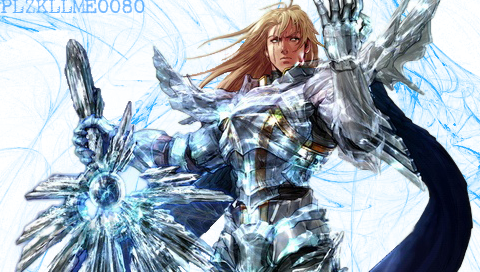
Tell me how it looks and stuff if ya could, ty.
EDIT: btw this was the 4th time total that i have used photoshop. the 4th thing i made with it .
-
August 19th, 2007, 12:55 #2DCEmu Old Pro

- Join Date
- Oct 2006
- Posts
- 1,828
- Rep Power
- 99
-
August 19th, 2007, 13:56 #3DCEmu Pro
- Join Date
- Sep 2006
- Location
- Midgar
- Age
- 33
- Posts
- 704
- Rep Power
- 103
Here i changed some stuff on it. do you guys think it's better?
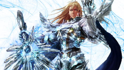
EDIT: actually i just added a smoke type thing coming from soul caliber.
-
August 19th, 2007, 16:34 #4DCEmu Regular

- Join Date
- Sep 2006
- Location
- Here and there
- Posts
- 252
- Rep Power
- 71

Show us the original stock/render and I'll comment.
-
August 19th, 2007, 16:42 #5DCEmu Pro
- Join Date
- Sep 2006
- Location
- Midgar
- Age
- 33
- Posts
- 704
- Rep Power
- 103
This is the original picture that i used for it.
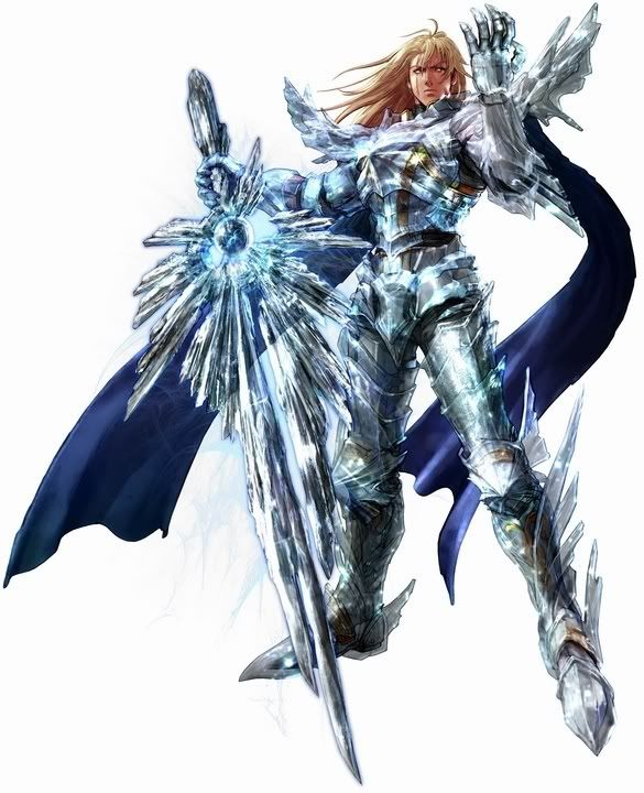
And I'm asking how it looks not how detailed I made it.
-
August 19th, 2007, 17:58 #6DCEmu Legend

- Join Date
- Dec 2005
- Location
- Galaxy not far away?
- Age
- 37
- Posts
- 4,656
- Rep Power
- 104

ummm... did you add any details???? it seems you didnt
-
August 19th, 2007, 18:46 #7still alive


- Join Date
- Mar 2006
- Posts
- 10,509
- Rep Power
- 0
Yes it's better now without the text. I love Soul Calibur

-
August 19th, 2007, 21:54 #8DCEmu Pro
- Join Date
- Sep 2006
- Location
- Midgar
- Age
- 33
- Posts
- 704
- Rep Power
- 103
All I really did was add some brush strokes to the background. I tried making a light source and stuff but it didnt look as good, so i left the light source out and didnt use it. Originally Posted by acn010

and the text is actually still there, it's just very transparent. Originally Posted by JKKDARK
-
August 19th, 2007, 23:11 #9Dreamcast User

- Join Date
- Aug 2006
- Location
- Hyperspace
- Posts
- 1,704
- Rep Power
- 134
it looks better as the sig, but despite you not really changing the image it still looks pretty cool!
Thread Information
Users Browsing this Thread
There are currently 1 users browsing this thread. (0 members and 1 guests)

Bookmarks