


 Reply With Quote
try adding some light sources and brighten it up.
Results 1 to 7 of 7
-
December 7th, 2007, 01:12 #1DCEmu Pro


- Join Date
- Sep 2006
- Location
- Midgar
- Age
- 32
- Posts
- 704
- Rep Power
- 100
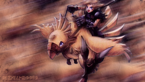
 My best PSP Background yet - Chocobo Ride
Yup, I feel this is my best creation yet. PLZ rate.
-
December 7th, 2007, 02:03 #2DCEmu Legend

- Join Date
- May 2006
- Location
- The Lounge Awesomeness: 1337
- Age
- 32
- Posts
- 4,026
- Rep Power
- 137


-
December 7th, 2007, 02:04 #3DCEmu Pro
- Join Date
- Sep 2006
- Location
- Midgar
- Age
- 32
- Posts
- 704
- Rep Power
- 100
o ya I was gonna do that but I guess I forgot.
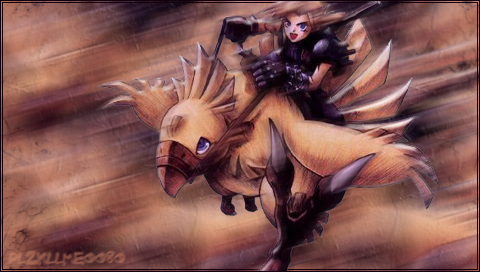
EDIT: heres another one with a border
-
December 7th, 2007, 23:10 #4DCEmu Rookie

- Join Date
- Sep 2007
- Location
- Uhhh. . .
- Posts
- 146
- Rep Power
- 0
8/10 I like the one with the border better.
-
December 8th, 2007, 12:11 #5Acorn Electron User
- Join Date
- Nov 2004
- Posts
- 780
- Rep Power
- 78
Looks really good. I like seeing hand drawn art.
I think tonally, the main character and bird look very similar to the background tones and perhaps you might want to try to lift the character/bird out a bit more or doing something to differentiate the two. Like Buddy mentioned, adding or exaggerating some light sources and highlights would help or maybe looking at the background. Maybe making it slightly darker or altering the colour hues.
Softening some of the edges around the character/bird may also help it look less cut out.
IMO the border is surplus to requirements and adds nothing but that's just personal preference.
Nice work Mr. Plz!
-
December 8th, 2007, 13:04 #6Puzzle Solver

- Join Date
- Jul 2007
- Posts
- 844
- Rep Power
- 0
Looks pretty good

-
December 8th, 2007, 18:24 #7DCEmu Rookie
- Join Date
- Sep 2007
- Location
- Uhhh. . .
- Posts
- 146
- Rep Power
- 0
LoL, nice Christmas avvie, Beetroot.
Thread Information
Users Browsing this Thread
There are currently 1 users browsing this thread. (0 members and 1 guests)

Bookmarks